
If you like DiskothiQ, you may also like:
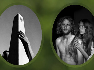
The Jordan Lake Sessions: Volumes 1 and 2
by the Mountain Goats
supported by 11 fans who also own “Seahawks”
This song is an anthem for me. I will survive out of spite to those that don't want me to.
go to album
Songs for Pierre Chuvin
by the Mountain Goats
supported by 10 fans who also own “Seahawks”
Any given album from the Mountain Goats is a genuinely unique experience and this is certainly no exception. :)
go to album
supported by 8 fans who also own “Seahawks”
every few years i remember this album exists and it slaps so hard. thank you pph
go to album
The Jordan Lake Sessions: Volumes 3 and 4
by the Mountain Goats
supported by 7 fans who also own “Seahawks”
Purely obsessed with the energy of these shows. I would sacrifice a limb for a vinyl, not gonna lie. missing that energy today..... 😔
go to album
Marsh Witch Visions
by the Mountain Goats
supported by 6 fans who also own “Seahawks”
A gem. JD being lovely and generous as usual : ) Thank you (again and always). God bless *
go to album
Hex of Infinite Binding EP
by the Mountain Goats
supported by 6 fans who also own “Seahawks”
It starts with a song about/dedicated to Man-Thing, you can't really go wrong from there.
go to album